Website
Website Analysis 1 - Avril Lavigne:
Homepage:


Linked Page 1 - Merch:


"You" - direct address

colour palette - consistent with rest of website + \punk style
Stars - Punk styled

Linked Page 2 - Tour

Avril Lavigne's website effectively uses a wide range of Media Language in order to appeal to her target audience.
On her homepage, at the top of the screen, we are able to see a navigation bar. This is used in order to make the interface user-friendly and to simplify the navigation of the site, as well as allowing the user access to the linked pages. The colour palette used for the text is consistent with the colours used for the rest of the text found on the website. The vibrant orange & green placed on a black background makes the text easier to read. The colour black has connotations with punk/rock and neon orange and neon green have connotations of high energy and excitement. These connotations are able to be associated to Punk - the style of Avril Lavigne. The audience will be appealed by this, as they will likely have a similar style inspired by her. Below this is a picture of Avril Lavigne with the text "Avril Lavigne" in a stylised font. The typography is styled so that the 'A's are the anarchy symbol and a star, and so that the dots of the eyes are a skull and a cross. These are symbols commonly associated with punk, a style which Avril and her audience have. In the picture, the Mise-En-Scene of her clothing fits the genre of punk/rock. Her clothing is more revealing, which represents her in a slightly sexualised way. The use of an eye-level camera shot places the audience at her level, allowing her to communicate with her audience through the direct address of her staring into the camera. Through using these types of Media Language. Avril is represented as a Rock/Punk star. This representation fits the codes and conventions of a rock website/artist. The image to text ratio has more images than text, which shows that the website is more about displaying the artist and her music rather than information.
Also, we are able to find a video of her most recent music video release. This shows the link between her content and her website. Below this is a back catalogue of all her old/previous songs and music videos. This fits the codes and conventions of an artists website, as all bands/artists websites will promote their recent release (if they have one) and their previous songs/music videos.
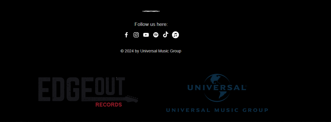
In the footer of the website, we are able to find the links to her social media pages. The use of the social media icons shows that Avril knows that her audience are likely younger and will understand and use social media more often. Also, there is a large amount of different social medias included (rather than just 3 or 4). This shows that both Avril and her audience are technologically advanced. Furthermore, we are able to find a 'copyright notice'. this informs anyone who is viewing the site that the content found is under copyright and not able to be reproduced/taken. This conforms to the conventions of band websites including social media links and notices in the footer of the website. However, she does not include links/logos for her record labels. This is different to what is expected from an artist/band website.
One of the websites linked pages is the "Merch" page. Through including a 'merch' page, it creates a sense of Fandom, as it allows the audience to buy clothes to support their favourite artist, as well as to find other fans when out in public. The use of the pronoun "you" in the text "If you are using..." is direct address, making it feel as if Avril is communicating directly with her audience, especially those who suffer from vision impairment and require reading assistance tools. The colour Palette of the 'Merch' page matches that of the rest of the website/linked pages, a black background with neon green, orange and white. Back has connotations of being 'Punk' as well as the rock genre. Furthermore, the stars that change from green to orange when hovered over are 'punk' styled, and look hand-drawn. The text is white, making it more visible from the black background.
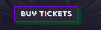
Another linked page of the website is the "Tour" page. This page also has a consistent colour palette to the rest of the website, black for the background, green white and orange for the text and shades of green and white text for the 'Tour' information. This allows the audience to have easy access to buy tickets, as well as to easily access information and see if a tour is happening in their country.
Avril Lavigne's social media pages do not contain links to her website.
In conclusion, a wide range of media language and website terminology is used effectively in this website to appeal to her target audience.
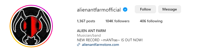
Website Analysis 2: Alien Ant Farm
AC/DC did not have a new song released, so I have chosen to study Alien Ant Farm's website instead.
Homepage:
Banner: Alien Ant Farm Logo, Link to new Album, Navigation bar with 'Store', 'Shows' and 'Listen'.
Link to album promotes it


Footer - logos of instrument brands, Marshall - Amps, GK - Amps, DW - drums, Remo - drums, Zildjian - mainly percussion, SD - guitar + effects pedals, Schecter - Guitars

Linked Page 1: Store


subscribe for updates option - allows them to have early access to information before others.
'Join the colony' - ants, theme
more social media links
Linked Page 2 - Shows:


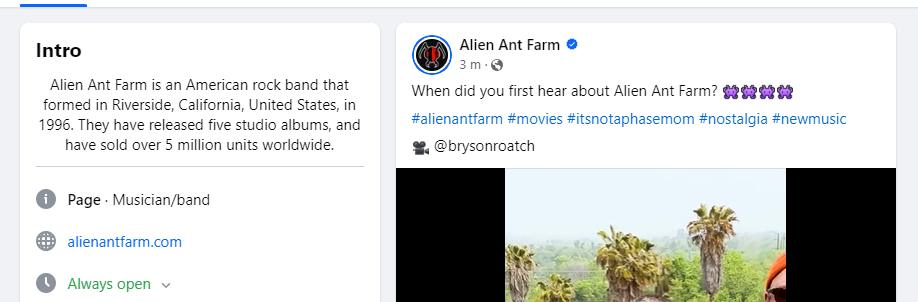
Social media to promote website & album:
Alien Ant Farm's website effectively uses a wide range of media language techniques in order to appeal to their target audience.
On the Homepage, we can see a banner at the top of the page. In this banner we are able to see the 'Alien Ant Farm' logo, A navigation bar, and a link allowing the audience to listen to their recently released album. The use of the logo creates brand recognition, as the audience would recognise the band and their logo. In the banner, a navigation bar is included. Through including this, it provides quick and easy access to the linked pages on the site. Finally, the banner also includes a button which takes the audience to a collection of links to streaming sites which allows the audience to easily access the ability to stream/download their new album and get views/plays. The colour palette of the banner is navy blue and white. The colour Navy blue has connotations of reliability and the colour White has connotations of perfection. This connotes that the band are reliable and can be trusted to create perfect content
Below this banner, we can see a music video linked. The song is "storms over" from their most recent album, mANTras. Through using this music video, it creates a link between their musical content and their website. It also promotes the album, by allowing the audience to have a showcase of one of the songs. we can also see different music videos playing as we scroll down the page. This serves as a back catalogue
As we scroll down the site, we find the icons of different social media pages which can be clicked to bring you to the bands accounts. There are only 3 linked, which shows that the band are a bit older and do not use social media all that often. The use of TikTok and Instagram will appeal to a younger audience who may be more inclined to use them, compared to Facebook which is notable for being used by an older age range.
At the bottom of the homepage, we find the footer. In this footer, we can see the logos of the different companies which supply the instruments to the band. This promotes the companies and allows people to see where the instruments are created. We can also see the copyright notice. This informs the viewer that the content is not to be shared/taken. Below the copyright notice, the text "CABLE CARS RUN THROUGH MY MIND..." is seen. This is an intertextual reference to their song rubber mallet from their album TruANT (2003). This is an intertextual reference that the older audience who had been their since the beginning would be likely to understand.
The first Linked Page is the 'Store' Page. Here, we can see merchandise from the band that allows the audience to show how much they love their creations. This creates a sense of Fandom, as the audience can recognise other fans if they are wearing the merchandise. Furthermore, it promotes the band and their music, gaining more fans and plays of their songs, as well as another source of income from selling the products. On this Page, we can also see the music video for 'Storms Over' promoted again. This helps to gain the video and the song & the album more traction & popularity in the industry.
At the bottom of the page, we can see 4 more links to social media. Instagram and Facebook are linked again, which implies that these may be the social media pages that the band are most active on. We also see twitter and YouTube linked, which could be viewed by a wide range of audiences. Furthermore, we can see an input box with "join the colony" above it. This is a subscription box which you can input your email into in order to receive updates quickly and easily. This allows the audience to receive exclusive content and provides the band a different way to earn money. The use of the text "join the colony" fits the theme of ants made by the band, and makes the audience feel as if they are all united in a group that is connected to Alien Ant Farm.
The second Linked Page is the 'Shows' page. Here, we can see dates, times, locations and names of the shows that they will be performing at. This allows the audience to easily find when and where the band will be, as well as to find out if a show will be happening close to their location. If the audience wishes to book tickets to a show, they only need to click the 'Tickets' button and will be taken to a page where they can buy the amount of tickets they need.
The colour palette of the 'Shows' Page is white with black and purple accents. The colour purple is associated with rarity and royalty and black is associated with power. This connotes that the bands performances are powerful. These colours could also be used to contrast the white background. BY providing the audience with a 'follow' button, it allows them to sign up to receive early access to information.
Alien Ant Farms social media pages have links to the website, allowing people to access the site regardless of where they found the band. They are also promoting the new album, through having the cover of the album as their profile pictures, as well as some of the page's bios saying ' NEW RECORD -mANTras - IS OUT NOW!" .
To conclude, Alien Ant Farm uses a wide range of media language effectively in order to appeal to their audience.
Website Planning:
1) My website will be used to promote my band. it will include my current music video, a social media feed. I will also include a 'merch' page to allow my audience to buy band merchandise. It will target my audience through including links to social media/streaming services, as well as providing access to tour dates/tickets and merchandise.
2) Pinterest Board: https://pin.it/26Lz5ccik
3) My website will include my current music video/a link to it to provide easy access to it for my audience. I will include a social media feed to appeal to my 16-25 year old target audience. I will include an introduction/bio of my band to appeal to new audience members and to fit conventions of band websites. I will include a subscription box to provide interactivity for my fans. My 'merch' page will include merchandise for the audience to buy.
4) Merchandise, Media/Social,
5) My Audio-Visual content will be a video of me entering Wembley Stadium from my POV. It will be styled like a teaser for where my band will perform during their next tour.
6) Daniel and Keeley wearing 'band merch' - merchandise page. Pictures of a crowd/audience. High key lighting.
7) Templates:
1:


Linked Page 1- Tour


Linked page 1 - singles:


3:


Website Design
Homepage:


Linked Page:


ANALYSIS: detailed and thorough with accurate terminology. Well done!
ReplyDelete